Screenshot of SaaS mobile app for NGO

Mobile App for NGO Data Collection

Empowering NGOs with Field-Ready Mobile Tools

2024-2025 SaaS NGO Mobile App Product Design Front-end Development

I partnered with a SA/UK-based social enterprise that helps NGOs and governments build no-code software tools to streamline programmes, track data, and improve transparency.

One of my key projects was designing a mobile app to extend their existing platform — transitioning essential workflows from a legacy desktop system to a mobile-first experience. The focus: offline access, modular components, and real-world usability in low-connectivity environments.


The Problem

Screenshot of the legacy system

A Complex Legacy Desktop App Inaccessible for On-site Use

NGOs, schools, and local governments use the platform to run complex programmes in sectors like education, infrastructure, and citizen engagement. While the system is powerful and deeply customizable, it wasn't built for field workers — many of whom have limited digital literacy and operate in low-connectivity environments.

These users don't need advanced configuration tools — they need something simple, reliable, and usable on budget Android devices with minimal training.


Users + Use Cases

Different Goals, Same Tool

The mobile app needed to serve a wide user base — including:

Field workers Urban farmers, school administrators, NGO staff
Programme coordinators Tracking attendance, uploads, outputs
Low-tech users Budget smartphone users, minimal training
Remote teams Operating in rural African regions with intermittent connectivity

Research + Discovery

Screenshot of Ant Design for mobile

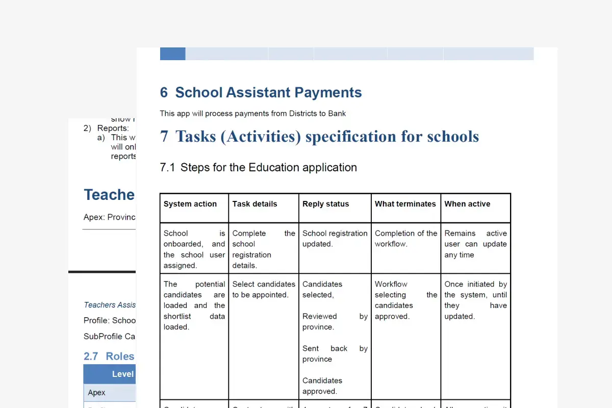
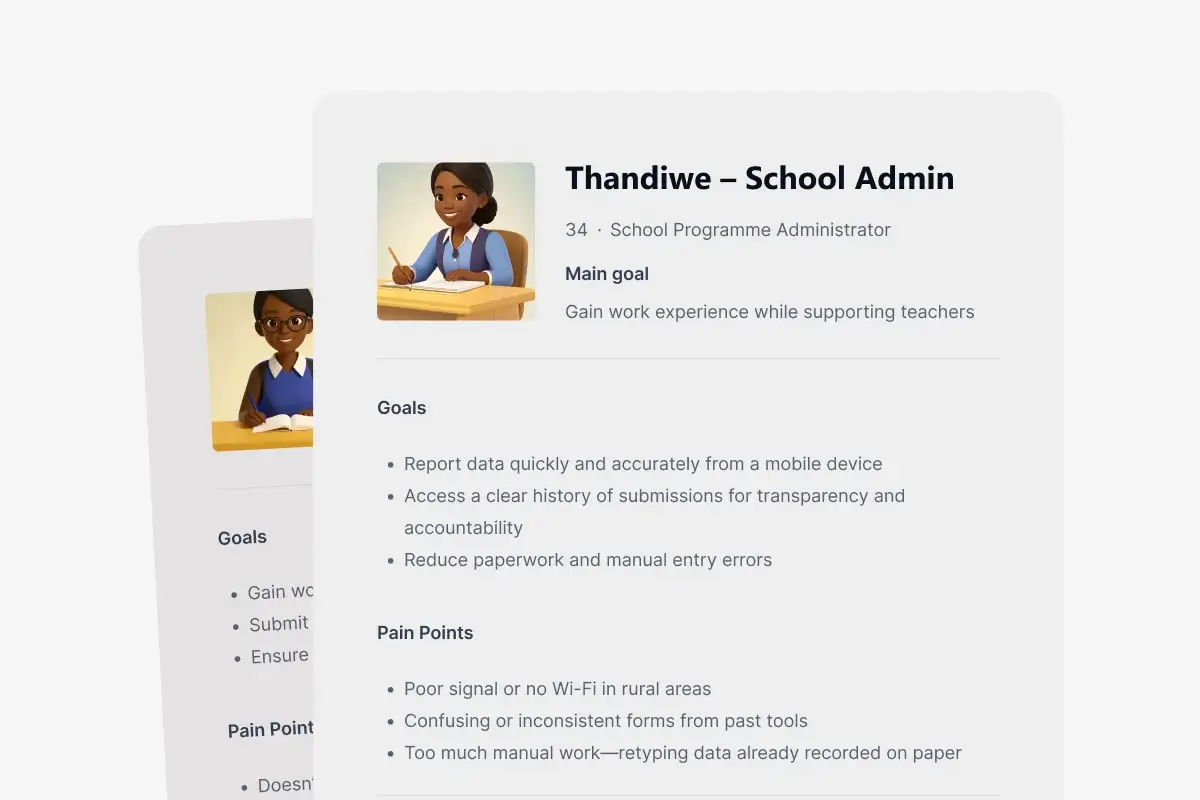
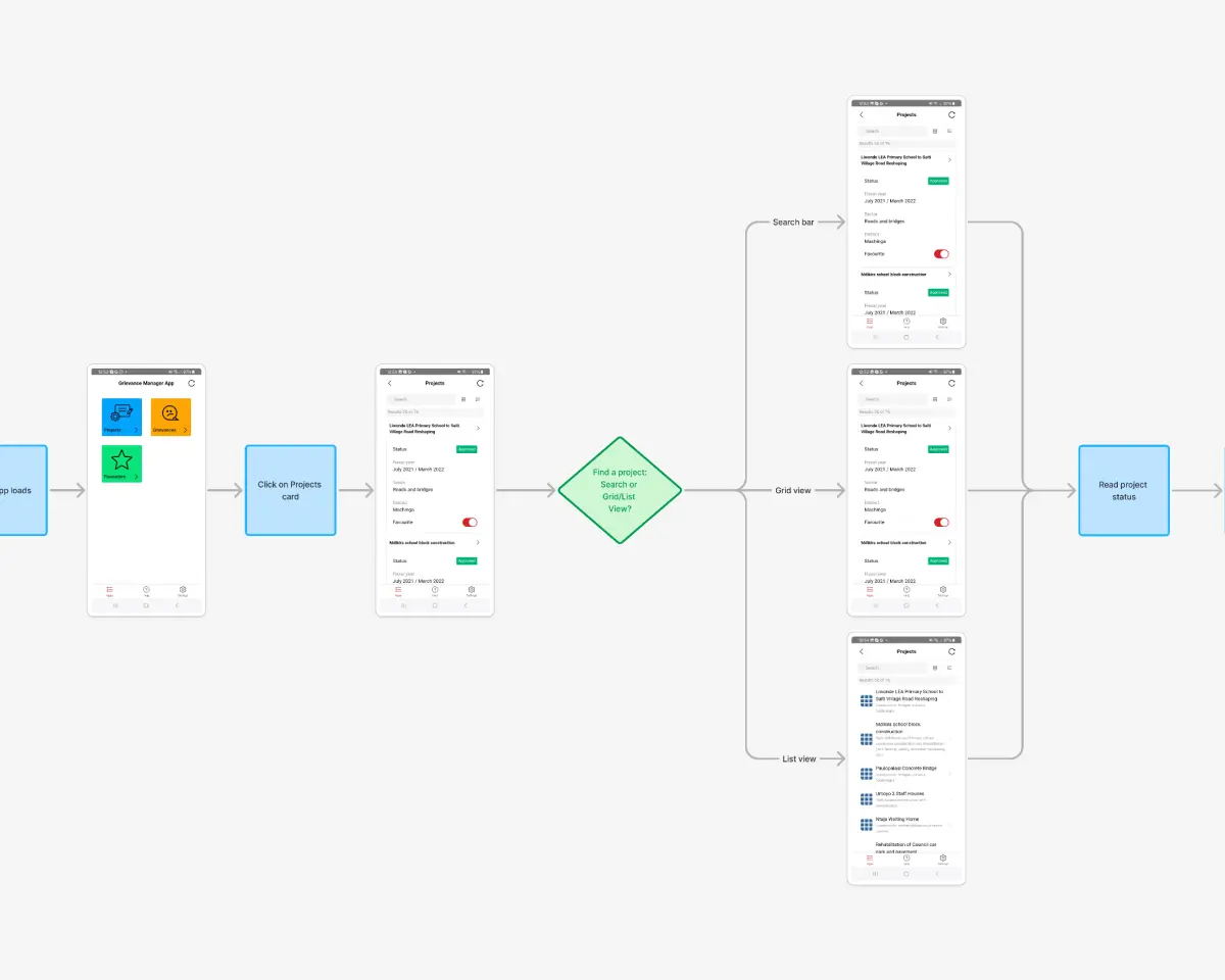
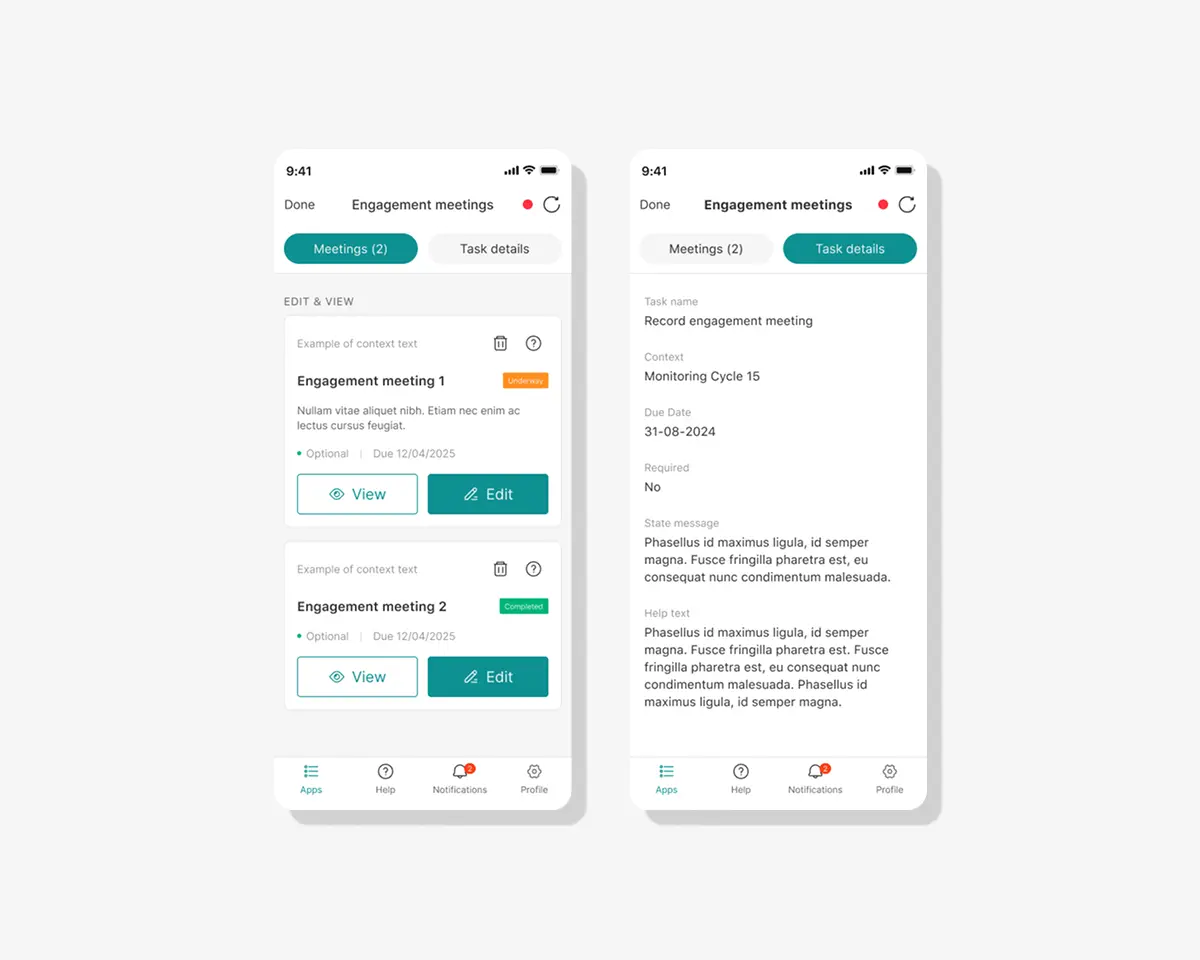
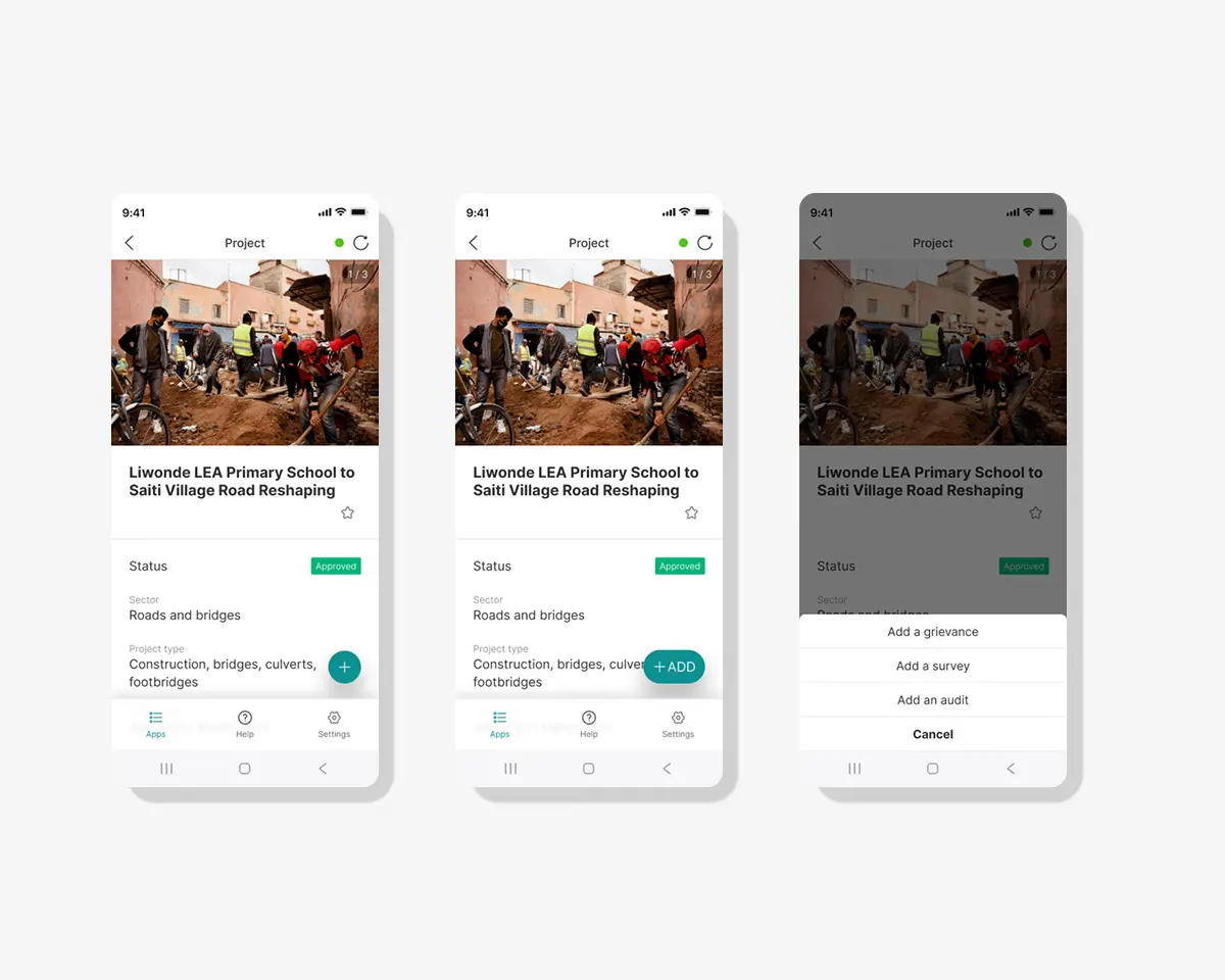
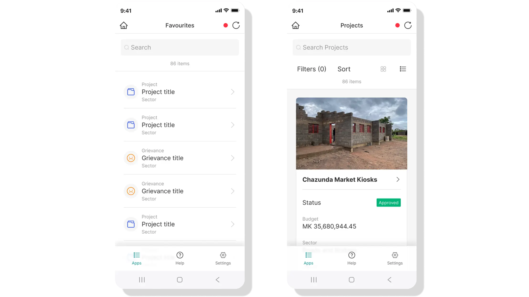
Understanding Users, Contexts, and Constraints

To ground the design in real-world needs, I conducted stakeholder interviews, reviewed requirements, and audited the legacy system to uncover usability gaps and technical constraints. I synthesized these insights into proto-personas and problem statements that captured the diverse user roles—from school assistants logging attendance to agricultural coordinators tracking harvests. Alongside this, I evaluated mobile UX patterns and Ant Design components to ensure the new system would be both intuitive and efficient to implement.

Process Highlights

Activity Output / Insight
Interviews with analysts & developers Key tasks, pain points, language, technical needs
Business requirements spec review Feature scope, constraints, priorities
UX audit of legacy system Identified friction points, complexity, redundant flows
Proto-persona development User types, behaviours, tech literacy, goals
Problem statements Guided design focus and key outcomes
Ant Design and Android UX pattern review Informed component choices, mobile UX standards
A glance at business requirements documentation

Leveraging Ant Design for Efficient, Modular Design

A key part of my discovery process was understanding the Ant Design React component library. I explored the documentation, tested interactive examples, and studied how components behaved within real-world layouts. This hands-on research helped me identify which components could meet the app's functional and usability requirements, and where custom solutions were needed.


SYNTHESIZE + DEFINE

Defining User Needs Through Representative Use Cases

By discussing their needs and reasons for using the app with the stakeholders I could draft quick and dirty proto personas to assist with my design process and illicite empathy for our users.

Due to the multiple use cases I focused on 4 apps and their relevant users, which included:

  • Urban farming initiatives
  • Grievance reporting and tracking
  • Attendance monitoring for school assistants
  • Community scorecard collection and feedback
An example of a user protopersona

Example: School Assistant Attendance

Problem Statement: The Education Department were launching a new programme for unemployed youth. They needed to manage assistant placements, ensure accurate attendance, and streamline payments.

Goal: A mobile-accessible tool for candidate tracking, document submission, and payroll — ensuring data integrity across schools, districts, and provinces.


The Solution

We aim to deliver a simplified mobile interface that supports core data collection tasks — without overwhelming users with unnecessary tools.

Key business goals

  • Improve data quality and timeliness
  • Increase field staff adoption
  • Enable programme scalability
  • Ensure compliance and transparency

Design process

Collaborative, Iterative Design Grounded in Real-World Implementation

Given the app's wide range of use cases, the design process had to be flexible, efficient, and tightly aligned with implementation. I worked closely with analysts to define key user flows, structure the information architecture, and validate early concepts through wireframes. These evolved into interactive Figma prototypes, which were used in regular walkthroughs with stakeholders and developers to ensure feasibility and relevance.

Process Highlights

Activity Output / Insight
Information architecture for modular app Established a scalable structure that supported varied use cases while maintaining clarity and consistency.
Key user flows with stakeholders Mapped essential user journeys based on stakeholder input to ensure relevance and coverage.
Wireframes Explored layout and navigation options to validate task sequences and data capture methods early.
Figma prototypes for demos Clickable demos shared regularly with stakeholders to gather alignment and feedback.
Iteration after walkthroughs Refined flows, labels, and interactions based on stakeholder feedback and real use scenarios.
Test case alignment Ensured UI and interaction logic aligned with test scenarios for QA and implementation handoff.
User flow for community app
View of tabs interaction
Shared figma prototype with team

UI + Visual Design

A Flexible, Brand-Neutral UI Built on Ant Design Foundations

Because the app was white-labeled for use by multiple organizations, the UI needed to remain visually neutral while still allowing for brand customization. I used the Ant Design for Figma Design System to build the interface—chosen specifically because it mirrors the Ant Design React component library used by the development team.

The system provided a robust set of pre-built UI elements—like buttons, dropdowns, notifications, cards, tabs, and grid layouts—that directly mapped to the codebase. This alignment meant that designs could be implemented with minimal translation effort, accelerating both prototyping and development. Where necessary, I designed custom components to meet specific client needs while keeping everything consistent, lightweight, and easy to build.

Testing out various components for adding functionality
Using a design system for swift prototyping
Screenshots of an app use cases

Testing + Handoff

Collaborating with Developers for a Smooth Transition

To support a seamless handoff, I created interactive prototypes that demonstrated key user flows and edge cases. I also prepared clear, concise documentation — including usage notes and component behaviors — to guide development and reduce ambiguity during implementation.

Final deliverables included:

  • Mobile prototype for key flows
  • Component library and variables
  • UX audit documentation
  • Developer notes and how-to docs

Takeaway

Designing for Real-World Impact by Knowing When to Simplify

Designing a configurable system for diverse real-world contexts pushed me to balance flexibility with clarity. It reinforced the importance of scalable UI patterns, semantic design systems, and close collaboration with developers to deliver thoughtful, adaptable solutions—without overcomplicating the user experience.

Bringing Your Product Vision to Life

Ready to create something amazing together? Let's get started.

Get in touch Get in touch